Employer Project
Appointment Booking via Hospital App
Working with our employer partners, a UX Design Agency to create wireframes for an appointment booking flow for a medical app. I was the team lead during week one, which focused on brief analysis, discovery research and defining user needs.
Role
Product design lead for week one, brief analysis and discovery.
Team of six.
Other stakeholders: Facilitator/Product Manager, Client.
Goals and Success Metrics
Business Goals: Design a simple customer facing booking process, allowing users to complete the task entirely online.
User Goals: Increase trust with key information, pricing and confirmation messages.
Metrics to monitor success: Task completion rate and user error rate.
Timeline and scope
Time frame: six weeks.
Project constraints: meet WCAG, aim for inclusive and accessible booking pages
and process for the wide range of users.
Scalable- the business is expanding.
Meet laws and regulations that apply to a medical app.
Be able to book an appointment in less than one minute - Client's request.
Platform: mobile iOS and android, responsive design, most common resolutions last 4 years
Research
Methods used: interviews, surveys, competitor analysis, usability testing, heat maps.
Key insights discovered users wanted a quick and simple booking experience, with a reliable booking system. Free from technical failures, that provided accurate information additionally choice of doctor
and time slightly outweighed other approaches for selecting appointments.
This research guided design decisions for the need to find the balance between simplicity, speed and trust.
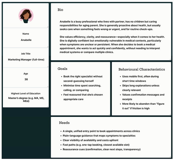
User Persona
Empathy Map
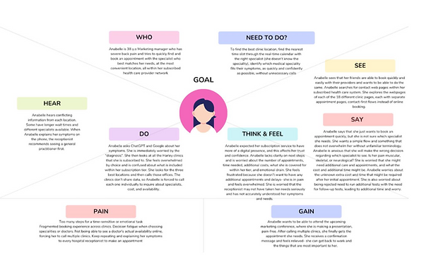
User Painpoints
Long booking processes requiring phone calls and waiting.
Transparency of costs, clarity of information, including medical jargon,
prompt appointment confirmation.
Too many steps and decisions.
User Needs
A single entry point to book appointments across a network of clinics.
Clear visibility of availability and costs with fast paths for example the next available appointment slot.
Problem Statement
Patients experience a fragmented and cognitively demanding appointment booking system due to unstable digital platforms consisting of multiple clinic pages with in consistent and unclear processes. Restricted visibility of appointments leads to manual follow-ups, creating uncertainty and delays, making it hard for patients to find appropriate specialists and appointments. This results in user frustration, deferred treatment, and increased administrative burdens for both patients and clinics.
Design Process
User Flow

Wireframes


Prototype Mid Fidelity
Design Iterations
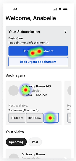
Removed 'Book urgent appointment' button as the user ability
tests showed it was causing confusion, users were unsure which appointment button they required.
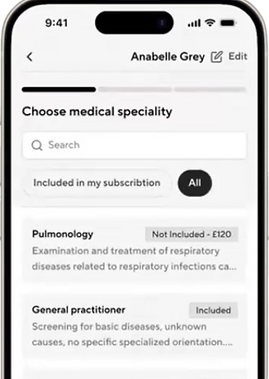
Linear step by step booking flow, with a progress bar across booking stages, back navigation with saved progress.

Added distance display within location cards, nearest location prioritisation and map view integrated.
Key Design Decisions
Focused on establishing a booking flow without an A.I assisted symptom checker, a feature the client would like. Due to discovery research indicating a user mistrust towards AI, scope of timeframe and budget constraints. A possible feature to be developed at a later point with care to meet relevant legal requirements, technical reliability and accuracy of symptom checker to maintain user's trust and create a useful experience.
Testing and validation
Concepts were tested via remote usability testing after each round of iterations.
Feedback received for each round of testing was used to make informed, evidence based
changes.
Outcomes and Impact
Reduced cognitive load across key screens
Improved scalability of booking system
Increased transparency of subscription logic
Embedded user control
Business Alignment
Designed toward less than one minute booking objective
Improved structural scalability for future expansion
Reduced ambiguity that may lead to drop off
Supported monetisation without compromising clarity.

Quantitive results (second round)
Task completion 100%
Average task duration 31% reduction
Misclick rate 36% reduction
Satisfaction rating 57% (excellent)
Reflection
What worked well ? The team collaborated well and was quick to establish effective communication channels and working practises.
Challenges faced included finding the balance between a quick, simple uncluttered process and screens with providing enough information for users to trust the app and make informed decisions.
What would improve a future iterations? Accessibility, I would want to improve on the start we made.
Key lessons learned, not to only focus on client goals like 'booking in less than one minute' as this may conflict with user needs, the solution is to compromise and find the sweet spot that meets both needs.